
Principles of Texture Matching in Interior Design
Texture is like the “soul’s hand” in spatial design—it touches our vision and sense of touch silently, shaping the warmth and temperament of a space. Excellent texture matching is comparable to the harmonious resonance of different musical instruments in a symphony: it not only creates rich layers but also maintains overall unity. Mastering the art of texture matching is the key to enhancing the quality of a space.
The Balance Between Contrast and Harmony
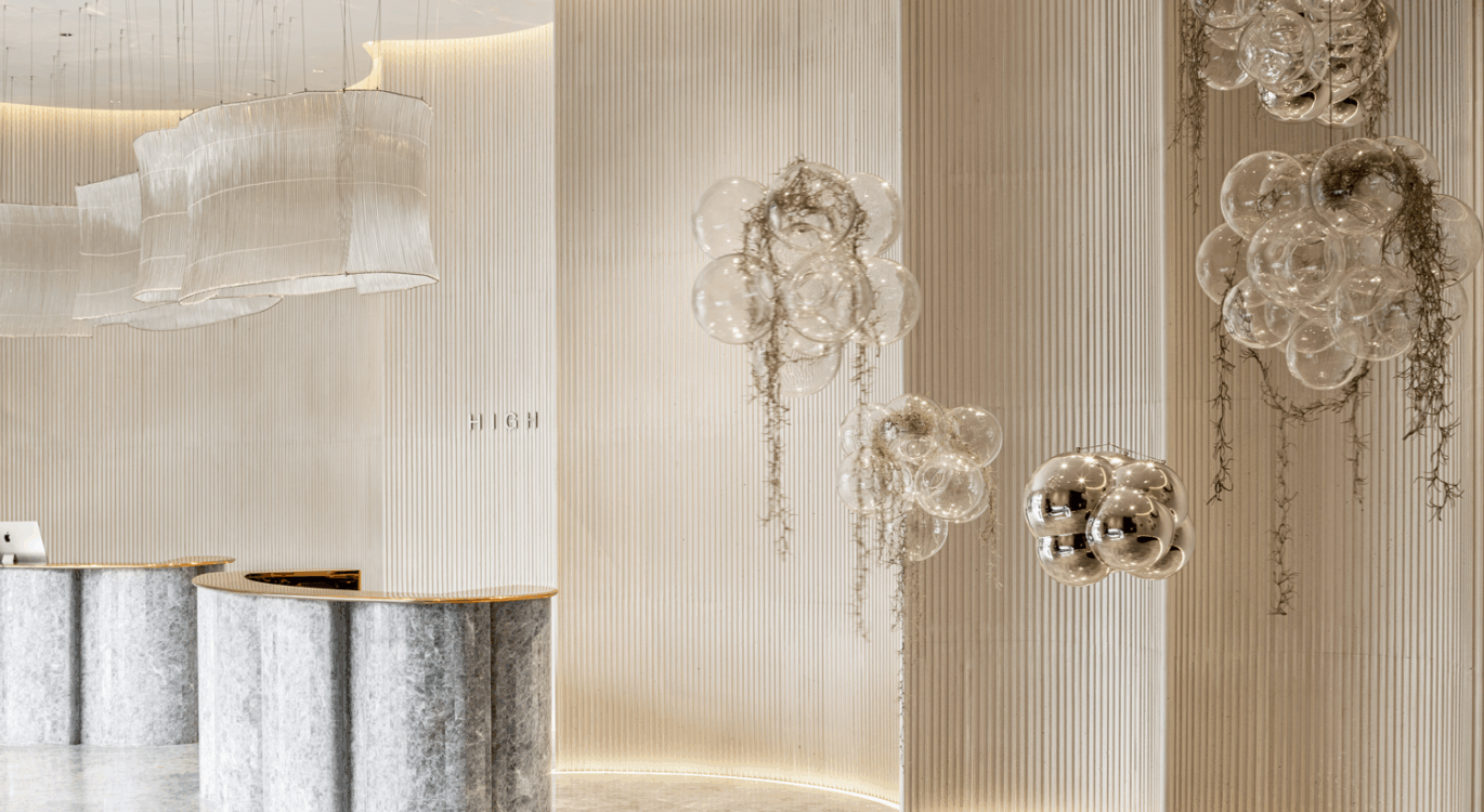
The core of texture matching lies in the delicate balance between contrast and harmony. A smooth marble countertop forms a tactile contrast with a rough cultural brick wall, while delicate silk curtains create a visual contrast with rugged wooden floors. However, such contrast needs to be controlled within a harmonious range, and the “70-30 Rule” is usually adopted: 70% of the basic textures remain unified, and 30% of key areas use contrasting textures. For example, when large areas of solid-color walls are used, textured carpets or decorative paintings can serve as visual focal points—this not only maintains a sense of wholeness but also adds layered variations.
Precise Control of Scale and Proportion
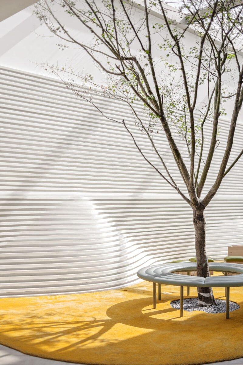
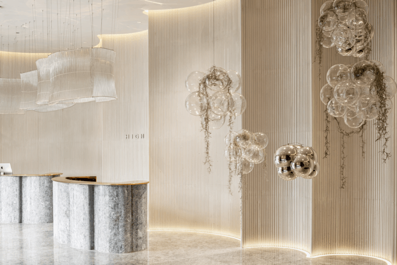
The scale of texture directly affects spatial perception. Large-scale texture patterns can make a space feel compact, making them suitable for spacious areas; small-scale textures, on the other hand, make a space appear transparent and are ideal for smaller spaces. Vertical textures can enhance the visual height of a space, while horizontal textures expand its width. In practical application, it is necessary to select the appropriate texture scale based on the size and shape of the space to avoid effects that are either overly obtrusive or too inconspicuous. Generally, it is recommended that the size of the main texture elements maintains a proper proportional relationship with the space area.
Dialogue and Echo Between Materials
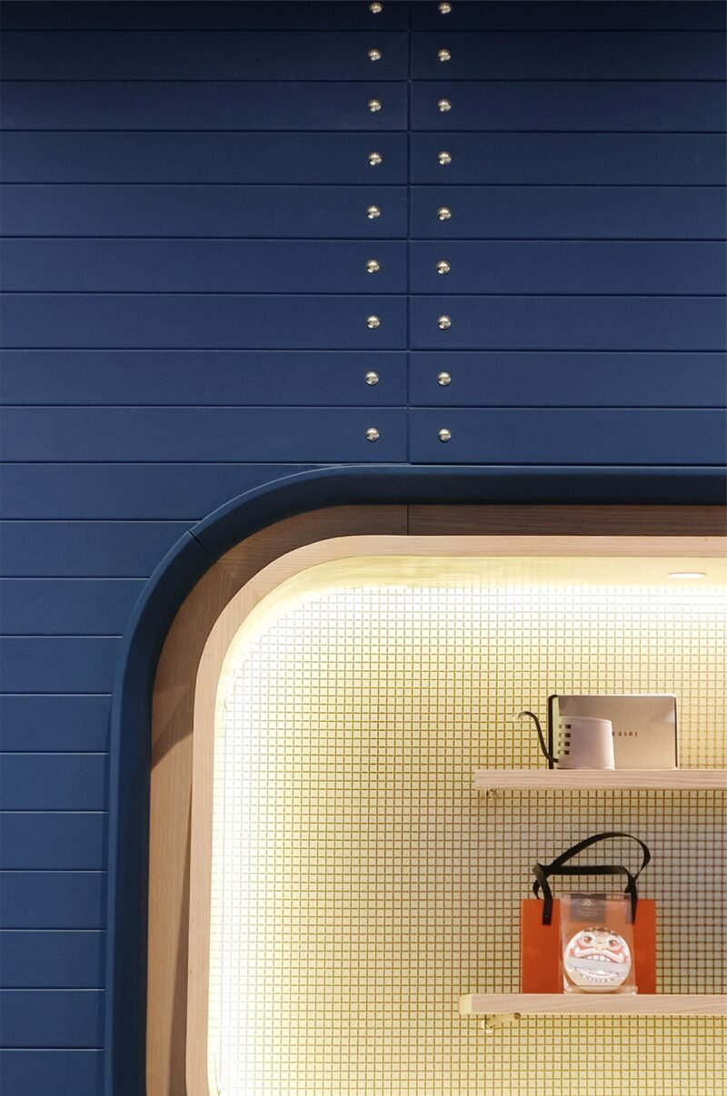
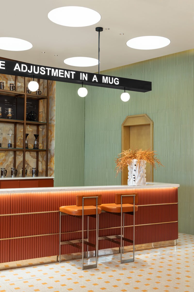
The dialogue between different materials is the essence of texture matching. The warmth of wood and the coldness of metal, the transparency of glass and the softness of fabrics—these material contrasts create a rich sensory experience. A successful material dialogue requires establishing a connection, either through color echoes or shape echoes. For instance, the curves of a metal lamp may echo the arcs of wooden furniture, and the natural texture of stone may engage in a dialogue with the pattern of a carpet. This echoing relationship creates an internal connection between different texture elements and strengthens the sense of wholeness.
Integrated Consideration of Touch and Vision
Texture design requires considering both visual perception and actual tactile experience. The texture effect when viewed from a distance is just as important as the texture experience when observed up close. Smooth surfaces produce rich light and shadow changes under light, while rough materials absorb light and create a soft atmosphere. In practical design, it is necessary to select appropriate textures based on the function of the space: areas with high-frequency contact should use materials with a comfortable touch, while visually focal areas can use textures with strong expressive power. This dual consideration of vision and touch makes texture design more three-dimensional and complete.
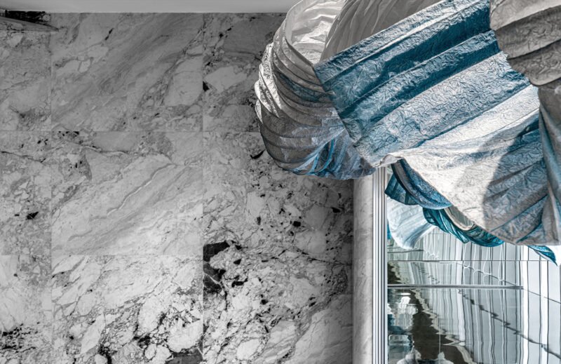
Excellent circulation design enables customers to follow the preset path unconsciously while feeling a strong sense of autonomy and comfort. Behind this seemingly natural flow lies the designer’s precise control over spatial structure, visual guidance, and behavioral psychology. When circulation design is perfectly integrated with commercial goals and user experience, the space becomes a “speaking guide”—silently leading customers through a pleasant commercial experience journey, and ultimately achieving the dual improvement of commercial value and user experience.