
Five Common Pitfalls in Soft Furnishing Design for Commercial Spaces: Have You Fallen Victim to Them?
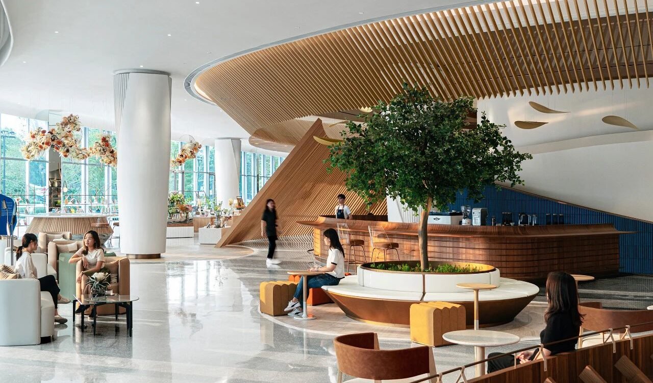
In commercial space design, soft furnishings are the soul-stirring elements that shape the space’s temperament and convey brand value. However, many designs fall into pitfalls during implementation, failing to enhance the spatial experience and even becoming “invisible killers” of the brand image. The following five common pitfalls deserve every designer’s vigilance.
Style Confusion – Disorganized Theme Expression
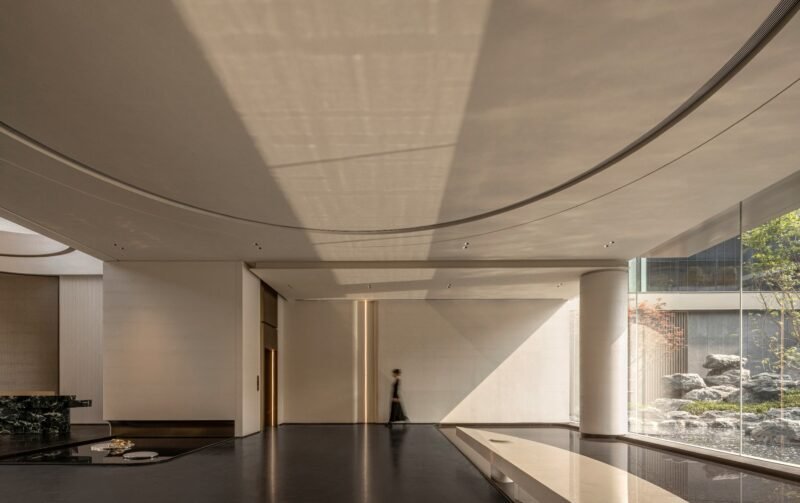
Placing a Nordic minimalist sofa in front of a Chinese-style carved background wall, or abruptly adding a Rococo-style chandelier in an industrial-style space – such a “hodgepodge” of styles is the number one trap in commercial space soft furnishings. Many designs blindly pile up popular elements, causing the space to lose its visual focus and even convey a chaotic brand tone. Unity of style does not mean monotony; true design wisdom lies in extracting core cultural symbols and forming a coherent narrative through the echo of materials, colors, and shapes.
Over-Decoration – Function Giving Way to Form
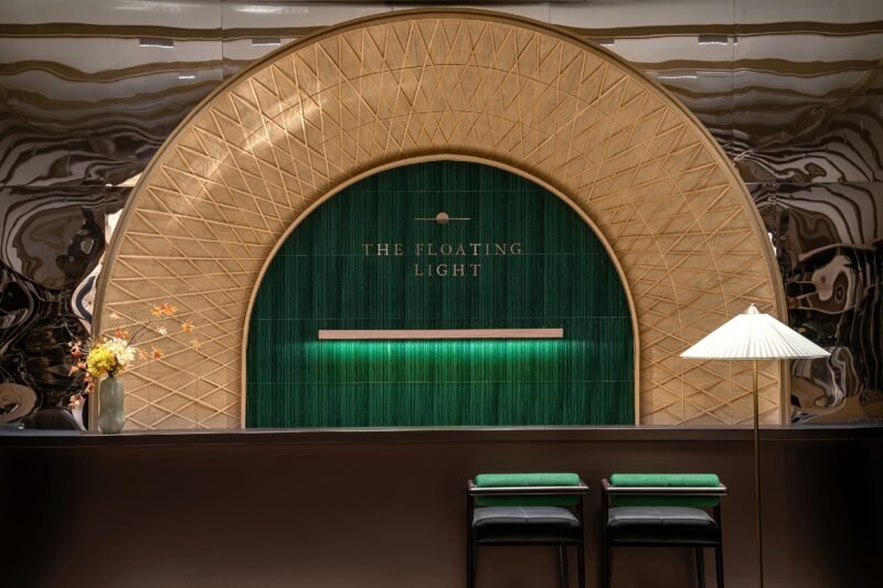
In pursuit of “visual shock,” stuffing a giant sculpture into a small exhibition hall, or occupying the aisle to set up a crystal array to create a “sense of luxury” – such decoration that sacrifices functionality is essentially putting the cart before the horse. The core of a commercial space is to serve people and commercial behaviors, and soft furnishings must first ensure the spatial circulation and practical efficiency.
Color Out of Control – Gorgeous Visual Pollution
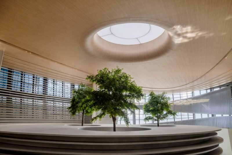
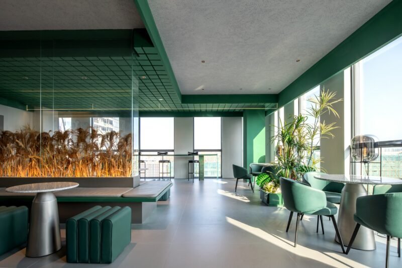
The golden rule of “no more than three colors” is often ignored. Some shopping mall rest areas use high-saturation red, blue, and yellow colors, which are intended to create a sense of vitality but instead cause visual fatigue for customers. Research in color psychology shows that people’s concentration decreases by 40% in a cluttered color environment. The solution is to establish a three-level system of “main color – auxiliary color – accent color.” For example, a coffee shop can use warm wood brown as the main color, off-white as the auxiliary color, and limit the accent colors to the emerald green of green plants and the dark brown of coffee beans, creating a rich and harmonious experience through layers.
Lighting Abuse – The Double Trap of Distortion and Glare
Luxury stores use high-brightness spotlights to densely illuminate display cabinets to highlight products, resulting in dazzling reflections on the goods; furniture exhibition halls use warm light filters to cover up material defects, making consumers exclaim “the product is not as shown” after purchase – these are typical failures in lighting design. Lighting in commercial spaces needs to follow the “trio” principle: basic light ensures safe lighting, key light accurately depicts product details, and ambient light uses indirect light sources to shape the spatial mood. At the same time, avoid “filter-style lighting” to ensure that products can maintain the texture seen in the exhibition hall even in natural light.
Static Thinking – Spatial Aesthetics That Refuse to Evolve
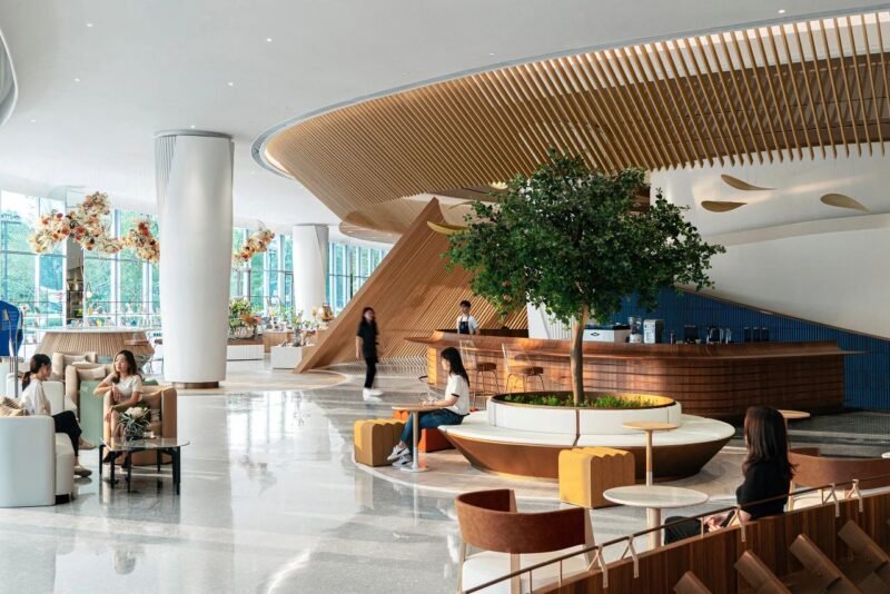
Treating soft furnishings as a “one-time project” and never updating them after completion causes the space to quickly lose its freshness. For example, the huge oil painting in the hotel lobby that remains unchanged for ten years, or the consistent festival decorations in a café. Commercial spaces need a “sense of breath” and can reserve room for change through modular design, allowing the space to become a carrier for continuously telling stories:
Seasonal changes: curtains, cushions, and green plants change color themes with the seasons
Rotation of art installations: cooperating with local artists to regularly update wall works
Introduction of intelligent media: digital screens dynamically display brand content
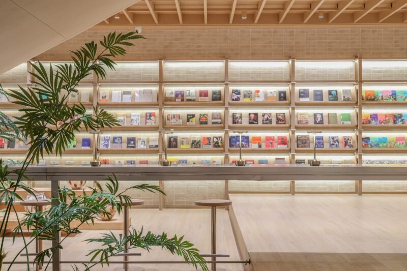
A space is like a person, needing both a skeleton and a soul. The essence of soft furnishing design is not the pile-up of elements, but the use of restrained techniques to convey the brand’s genes. When we jump out of the traps of “style hodgepodge,” “over-decoration,” and “color bombing,” and break free from the constraints of “distorted lighting” and “static thinking,” commercial spaces can truly become a poetic bond connecting brands and users.